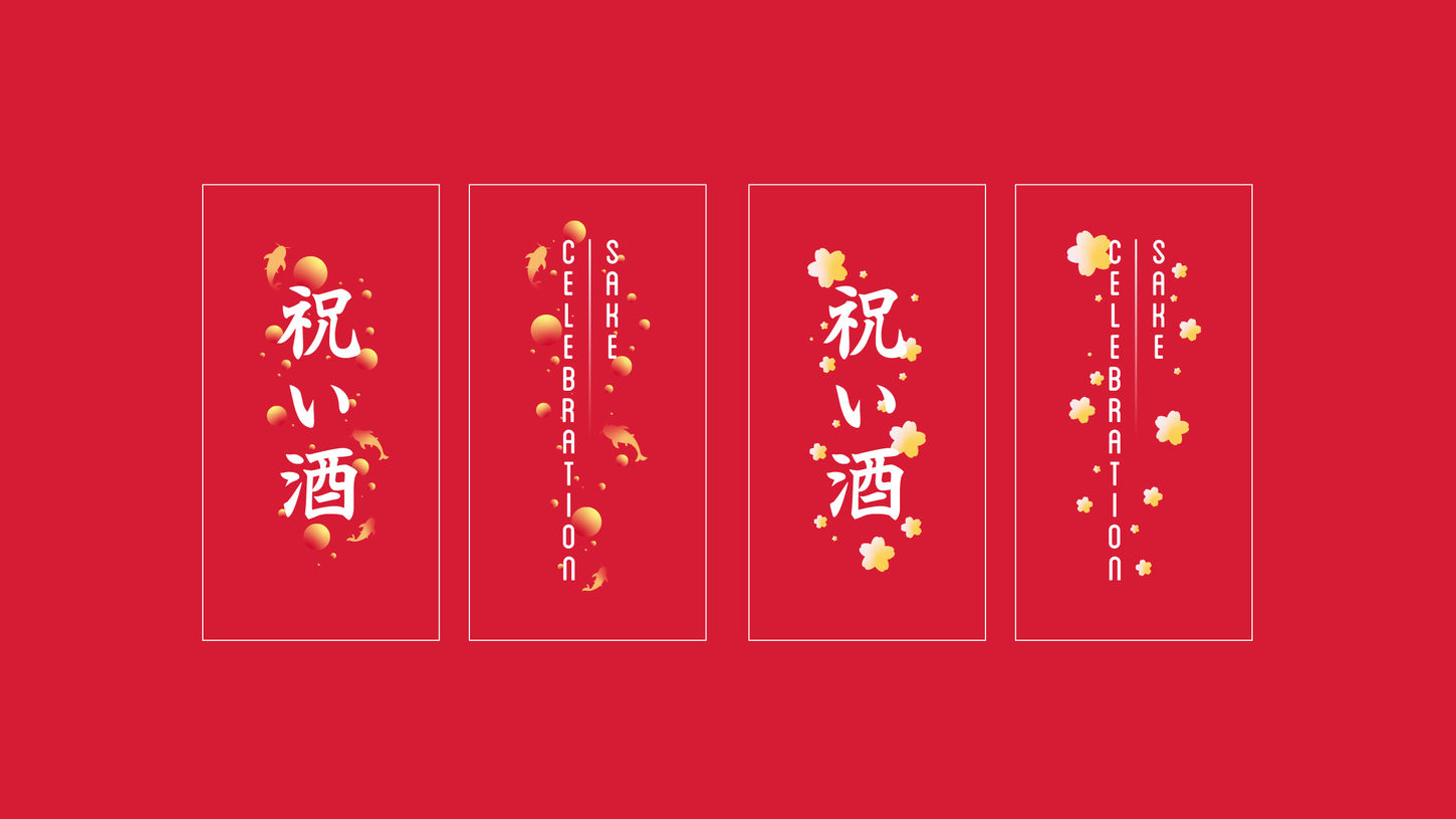
Celebration Sake aims to provide an exciting and versatile product series that combines elements of Japanese culture, celebration, and diversity. The project was inspired by the profound symbolism of koi and sea bream fish, recognized across Japan through traditions like fish kites as well as festive dishes, and the colour red, signifying prosperity, energy, power, and love.
The series features four distinct sake flavours, each presented in fish-shaped containers, catering to a spectrum of moods and occasions offering a meaningful way to interact with sake. Ultimately, the “Celebration Sake” project seeks to provide a playful and heartfelt way for people to celebrate, connect, and share moments of joy and love.
PACKAGING
CELEBRATION SAKE

As the project took shape during the strict periods of COVID-19 social isolation, coupled with Japan's persistent commitment to minimizing packaging waste, a distinctive opportunity emerged: the exploration of paper as an abundantly available material in my recycling bin. This was inspired by the investigation of Japanese gifting and festive traditions, which revealed an exciting prospect—designing dynamic packaging using versatile paper containers capable of accommodating a wide range of motion.
Challenge
Objective
To develop a playful and iconic product series that combines sake, celebration, and Japanese cultural symbolism, providing consumers with an opportunity to enjoy different flavours of sake festively.
Development
Inspired by toys sold at Japanese festivals, traditionally made from flexible materials like paper, polyethylene, or plastics, involving dynamic mechanisms for children, I aimed to create a design system with a popping open feature. However, due to paper being the only available material during development, I focused on gentle unpackaging systems to improve the package's durability and maintain its structural integrity over multiple uses. This was achieved by extending the inner bottle's body, incorporating an external handle to slide open the mouth of the surrounding packaging.


Braille
The project features a bilingual design system, incorporating labels and nutritional facts in both Japanese and English. Each container's face is designed to reflect the flavour through its distinctive tone and font. The braille adheres to universal specifications and is positioned on the top panel lid for accessibility, considering the limited space in the hand while holding the relatively small package.
Thank you!


