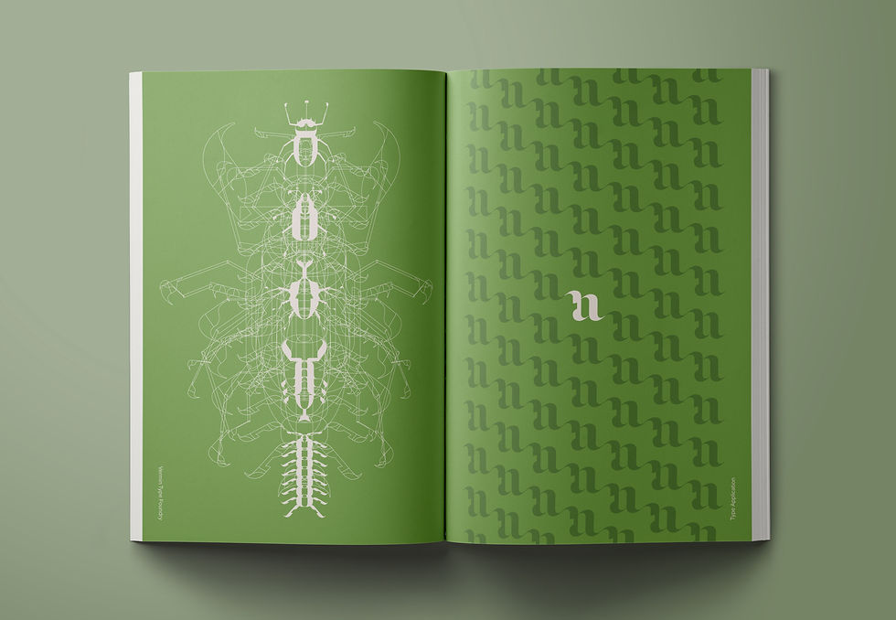
Vermin, in its initial conception, emerged from a fortunate mistake—unintentionally deforming vectors within a cursive letter. Through numerous iterations, the typeface underwent a process of deconstructing Victorian-era typefaces while incorporating insect-like elements. The final interpretation of Vermin stands as a fusion of the familiar and the exotic.
Inspired by the aftermath of insect activity in a cabbage field, Vermin demonstrates bits and pieces seemingly devoured or missing. Alternatively, one could distinguish the presence of insect limbs within its design. Both perspectives hold merit, as Vermin weaves insect-inspired nuances into its form. The typeface navigates the interplay of negative space, emphasizing contrasts and maintaining a harmonious balance of uniform weights.
Primarily developed as a display font, Vermin finds its strength in large-scale applications such as magazine covers and posters. Its distinctive form, born from a mix of organic irregularities and intentional design choices, ensures that Vermin leaves an intriguing impression in various visual contexts.
TYPEFACE DESIGN
VERMIN


